narrative
Role on Project
Lead Designer
Project Scope
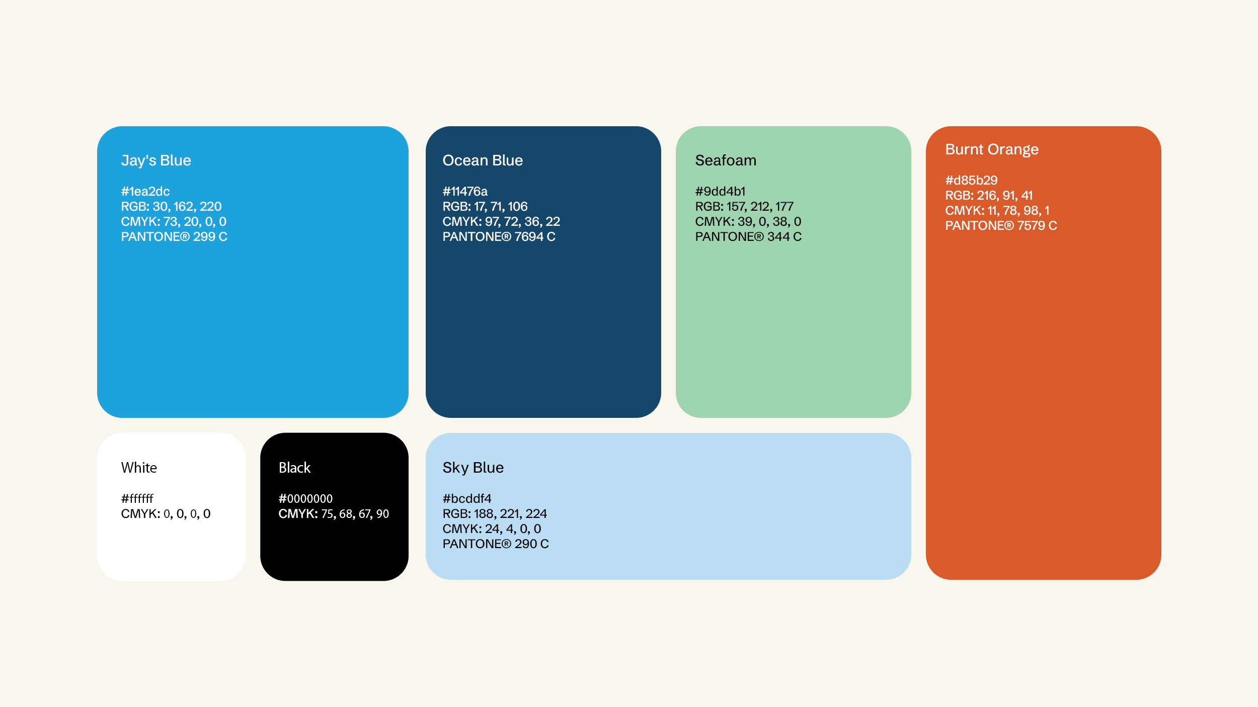
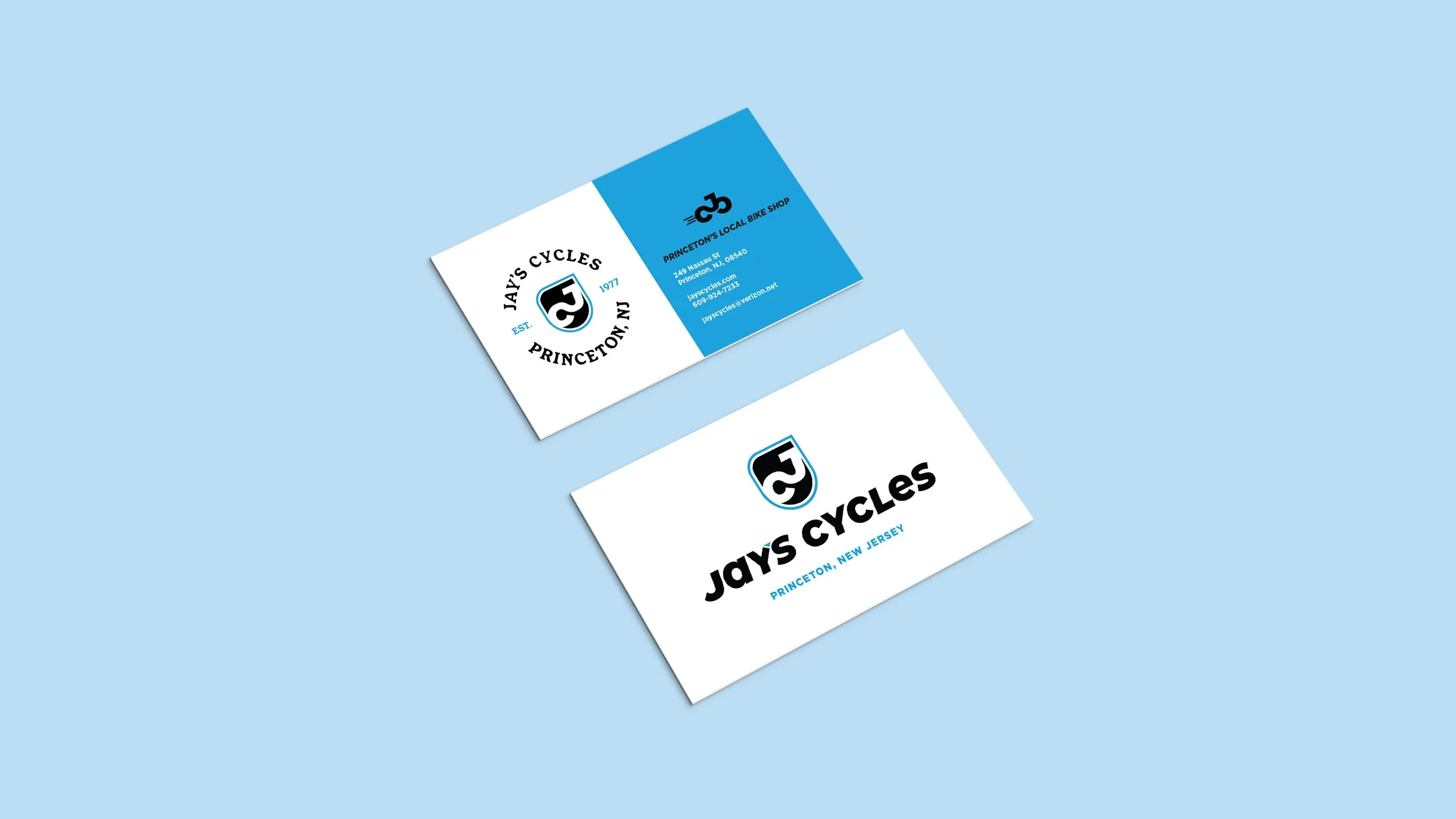
A full rebrand for Jay’s Cycles, Princeton’s local bike shop of 50 years. The new identity honors the shop’s legacy while introducing a fresh, modern look through updated logos, colors, and typography. The result is a cohesive visual system that feels both timeless and forward-looking across all brand touchpoints.
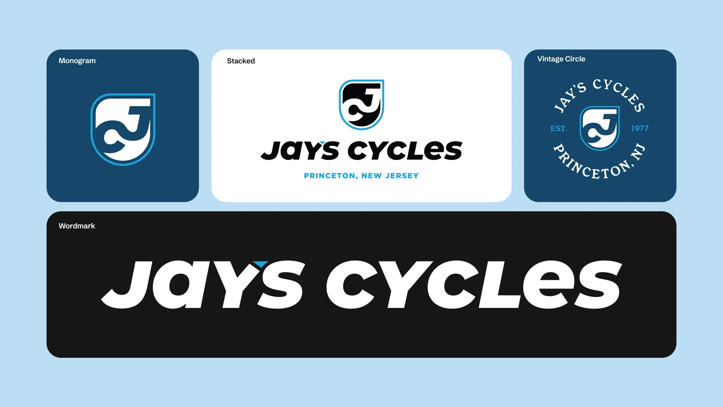
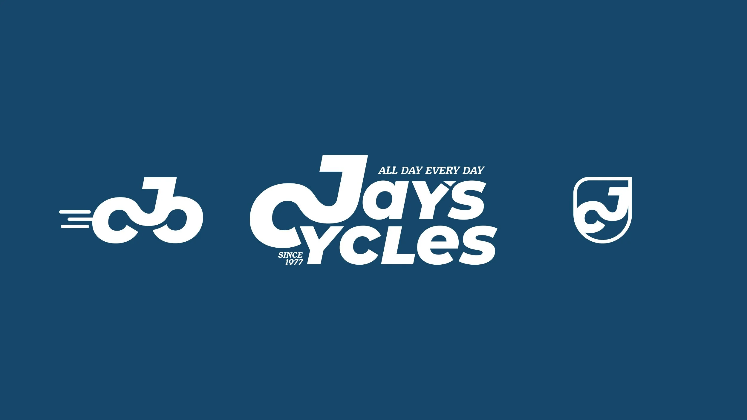

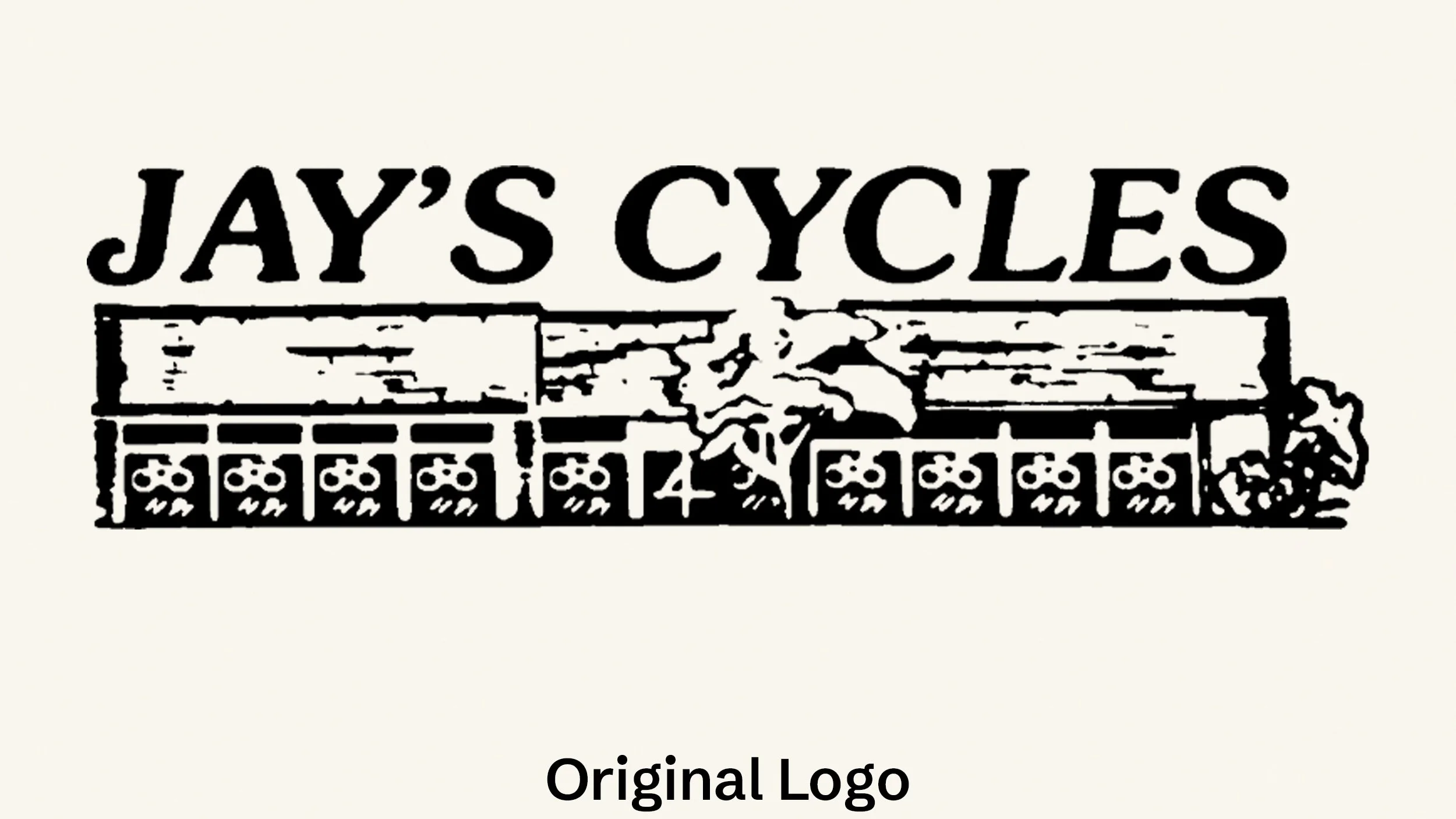
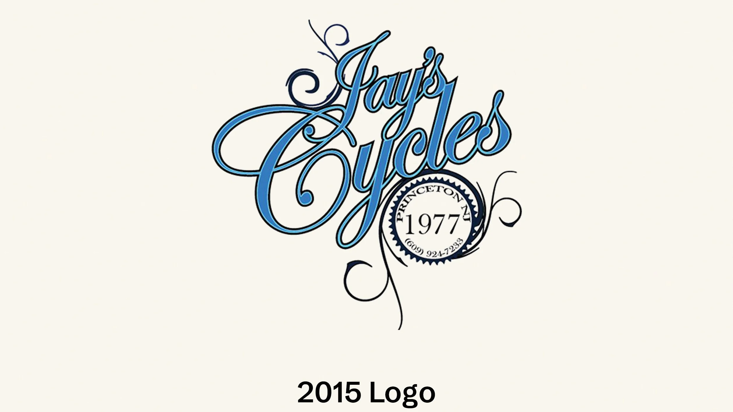
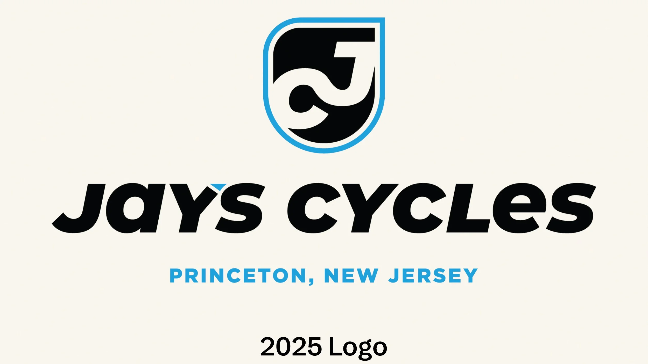
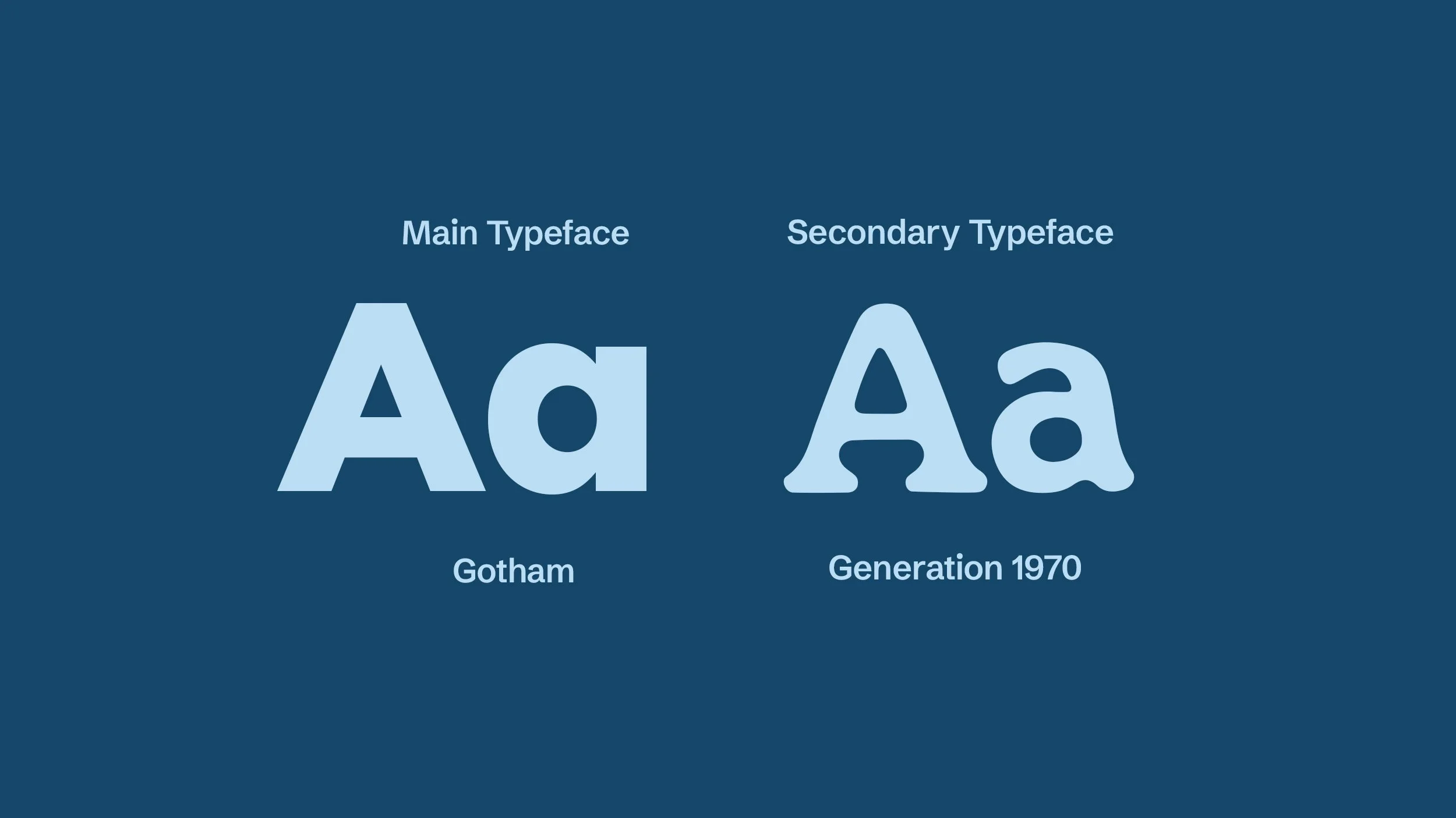
The objective for Jay’s rebrand was to develop a contemporary identity while preserving the timeless, classic feel of the original mark. By carefully refining the kerning and selecting a typeface that echoes the heritage of the original logo we achieved a balance of old and new.
Today, Jay’s Cycles benefits from a bold, modern wordmark aligned with top‑industry brands (e.g., Shimano, Trek, SRAM) while still retaining a vintage alternate logo option to honor their roots.